Absurd
|
|
The meaning of 'Absurd'
'Adjective'- utterly or obviously senseless, illogical, or untrue;contrary to all reason or common sense;laughably foolish or false an absurd explanation. 'noun'-the quality or condition of existing in a meaningless and irrational world. My interpretation of 'Absurd' is taking something different that wouldn't be taken in a normal situation. |
Activity #1: An absurd photograph
|
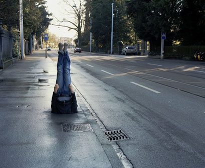
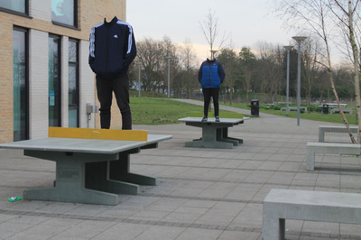
The photograph (by the artist Erwin Wurm) It looks to be in a quite, lonely road. A person legs sticking out like a lamp post, with no head or shoulders showing. It looks as if he is a hole ( a manhole possibly). I like the way that the Image has been adapted to an Absurd. what i like about the image the most is, wondering what was there first? What was Erwin's though process for taking this image and editing it in that way? How long did it take him to take that photo?
The way the person body is laid out, gives me questions of how he got there, However i like the reflection of the puddles and the wetness of the floor, which brings out the person more than it would if it was a dry and sunny day, i think the dark and gloomy street brings the image to life, to make it more focused on 'Absurd' than like contrast. Also this image creates the rule of thirds with the two Road signs and the top of the legs. |
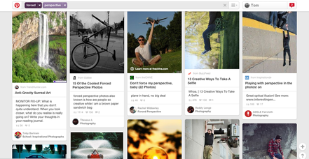
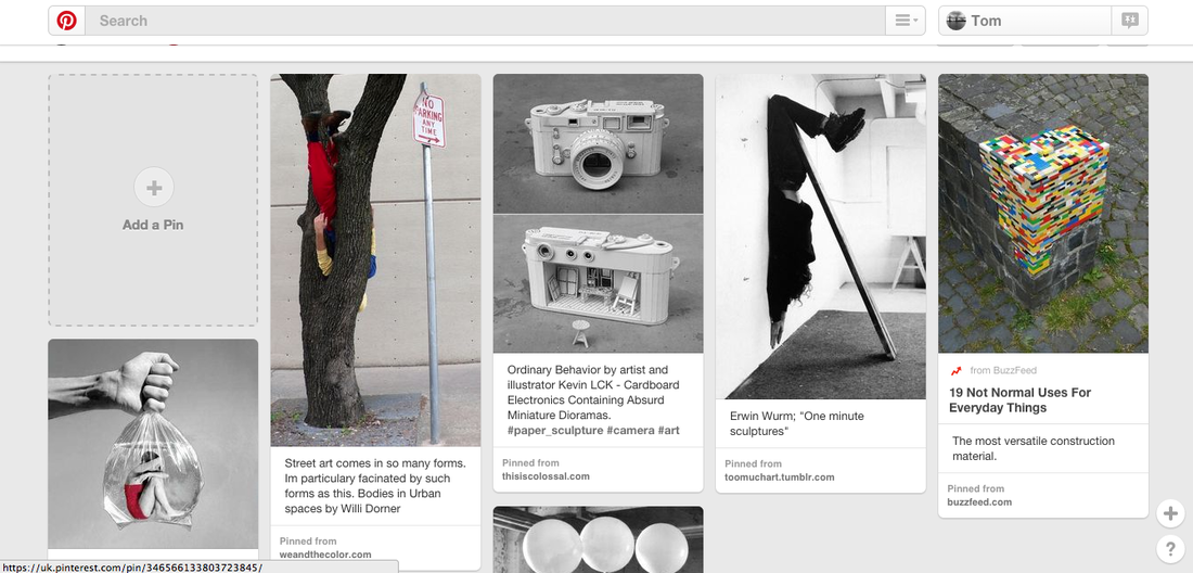
My Pinterest Board!
|
|
These are just a few images that i really liked and inspired me to take images on the topic of 'Absurd'
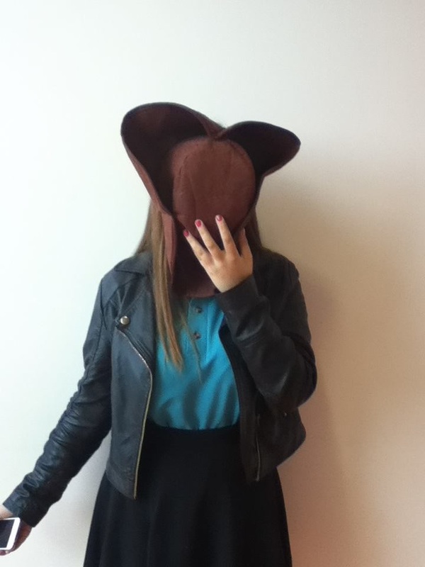
Activity #2: Hide - First Experiment
Working with a classmate, and using an iPod, take a series of absurd images using the instruction 'Hide'. Create a Gallery of your images and write a brief evaluation.
|
|
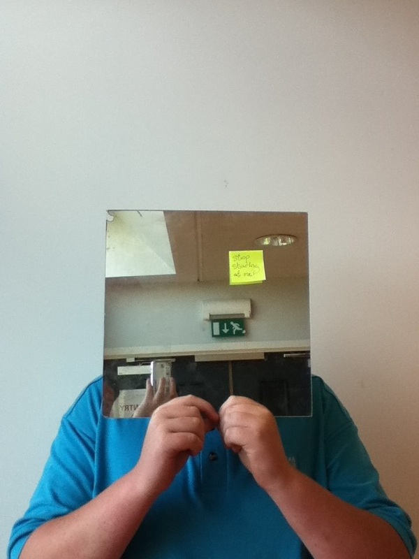
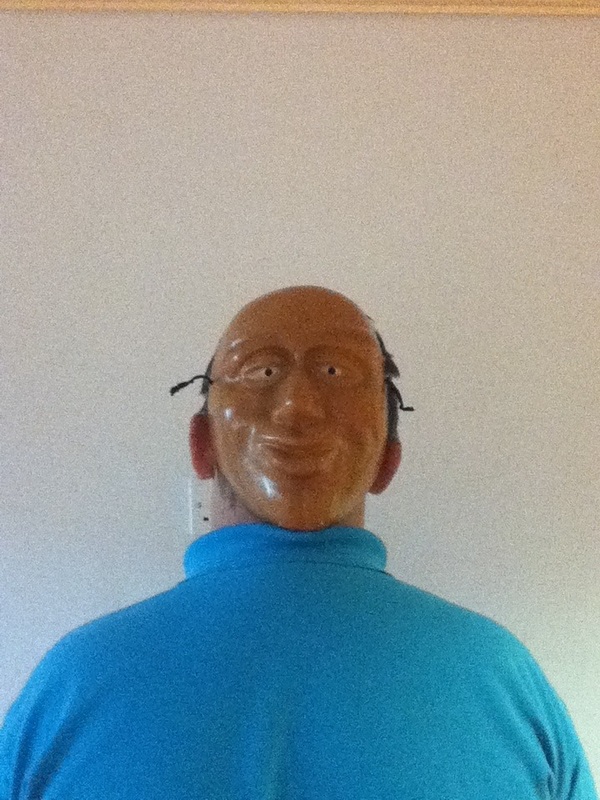
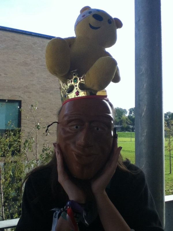
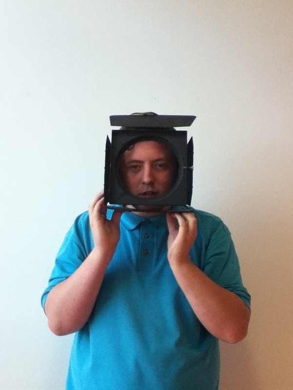
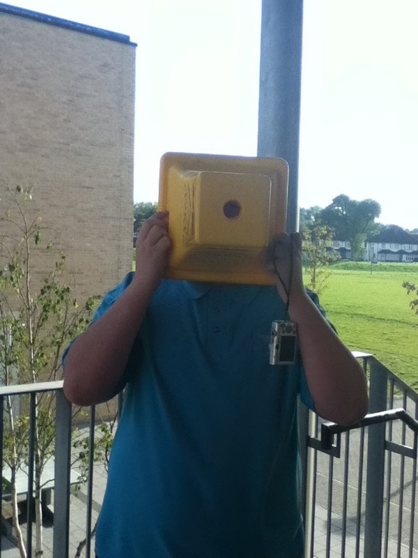
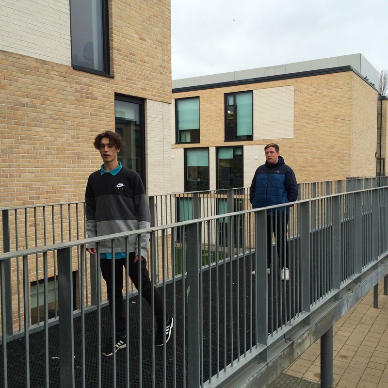
We had a task to go out and to take a demonstration of images which 'Hide Your Face'. i think it went successfully, although there are still improvements i still need to make. I like the lighting of all the images especially on the image with the West indies Prop because the lighting behind is strong it brings out a liveliness of the image, However i believe the image needs to be taken again because the photo has been taken in a central position of focus as i am slightly on the right of the image so the is a part of the image that is blocked. I don't like the image with the teddy bear on the head because There isn't enough lighting and also the teddy is half shown which gives a focus on the teddy more than hiding the face. A few of the images turned out well but i believe that ones with dark lighting or a background with to much going on ruins the image for example the one with the cone covering his faces causes to much attention to the background than the face.
|
Activity #3: HomeWork - Second Experiment
|
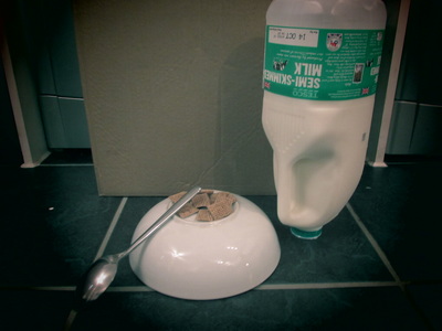
On the weekend i went down to the sea side to take a range of Photographs and also i took some at home, My favourite image i like is the image with the bird in the tree which i took on a ledge which was a the same exact hight as the tree was. I like the focus which i took it in, it focused on the tree branches and then the bird is slightly out of focus. The lighting in this photo is quite dim and dark, However because i was on a hill the sun was behind so there was no sun rays shinning on the hill. I would like to have taken it on a sunny day which would of change the exposure of the image, which would of caused a shadow on the bird, Also i wish i took it on my phone which i could of edited it and made it more effective to what i wanted it to look like. The other photo's i took i didn't really like them thats why i didn't include them but the ones i took in my house i liked because it looked different and thats what i take from 'Absurd' To make everything around you look different to the human eye.
|
|
Activity #4: Homework: 10 sign's - Third Experiment
|
|
I went out on the weekend to a different range of places, to take 10 images to make signs for the project that i am doing.The improvements i want to make is the actual sign i want to make them look realistic and actually good instead of having them on paper or actually on the photo. For example the one under the bridge i would like to have put on a yellow sign ( cut out of card in the shape of a danger sign) which i think would look really good, also i would change the type of pictures i take, to make them more suit the topic which i am doing instead of taking things that i want to. However i like how the images are neat and are similar to each other.
The next time i go out which will be to 'London' i want to take more of a smaller amount of images but more detail, but i want to make a few signs the night before but make them look professional. The equitment i am going to use is Card,Laminator,Cannon Bridge Camera and A Camera Stand. |
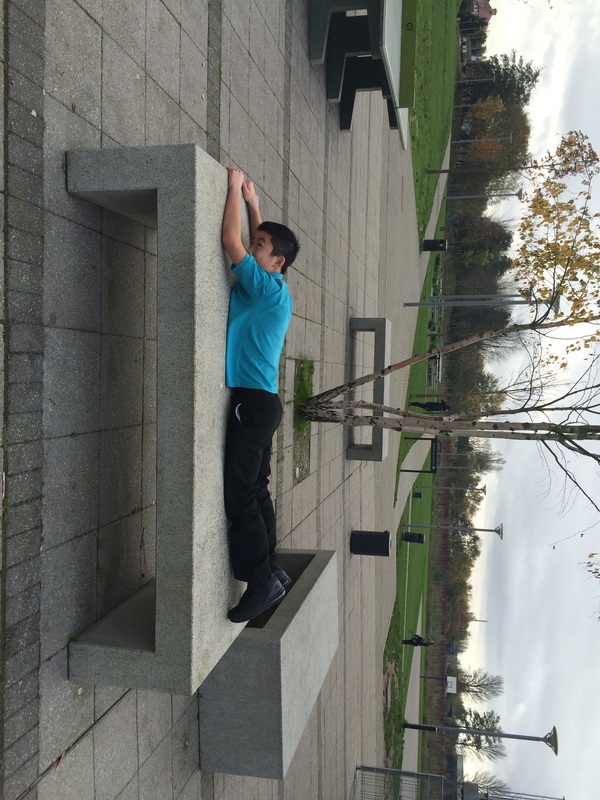
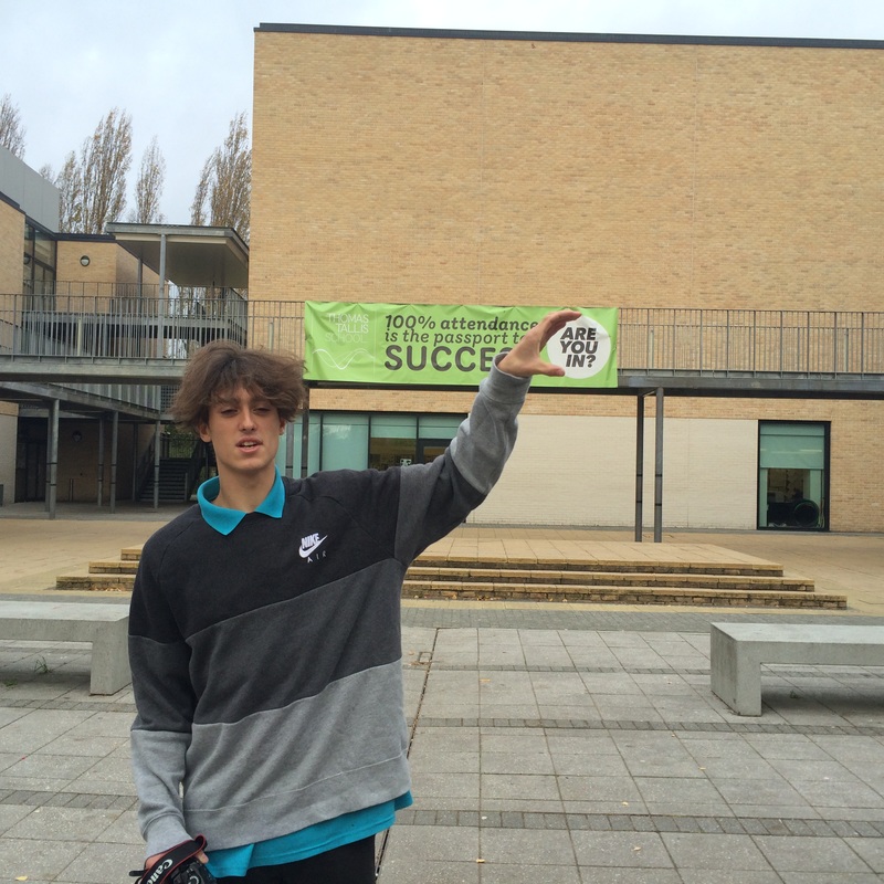
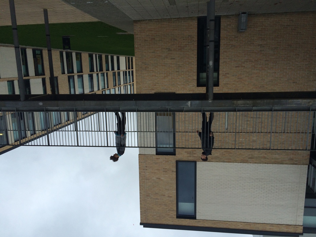
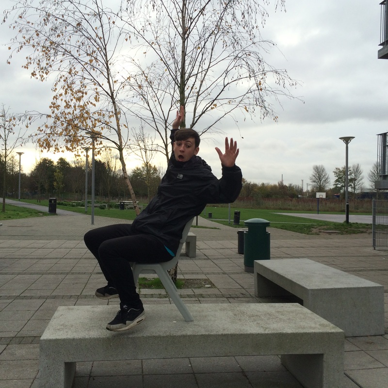
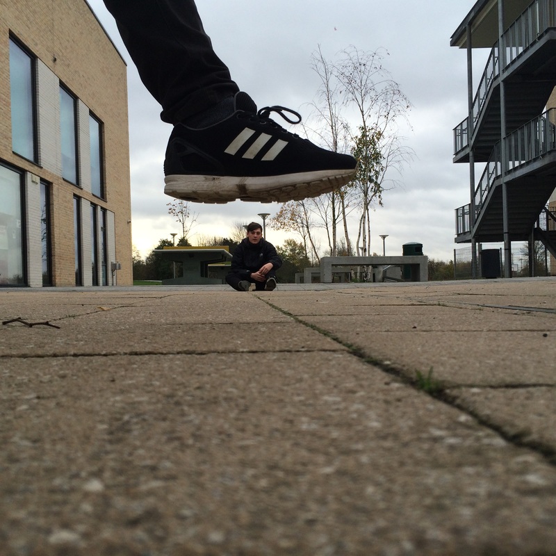
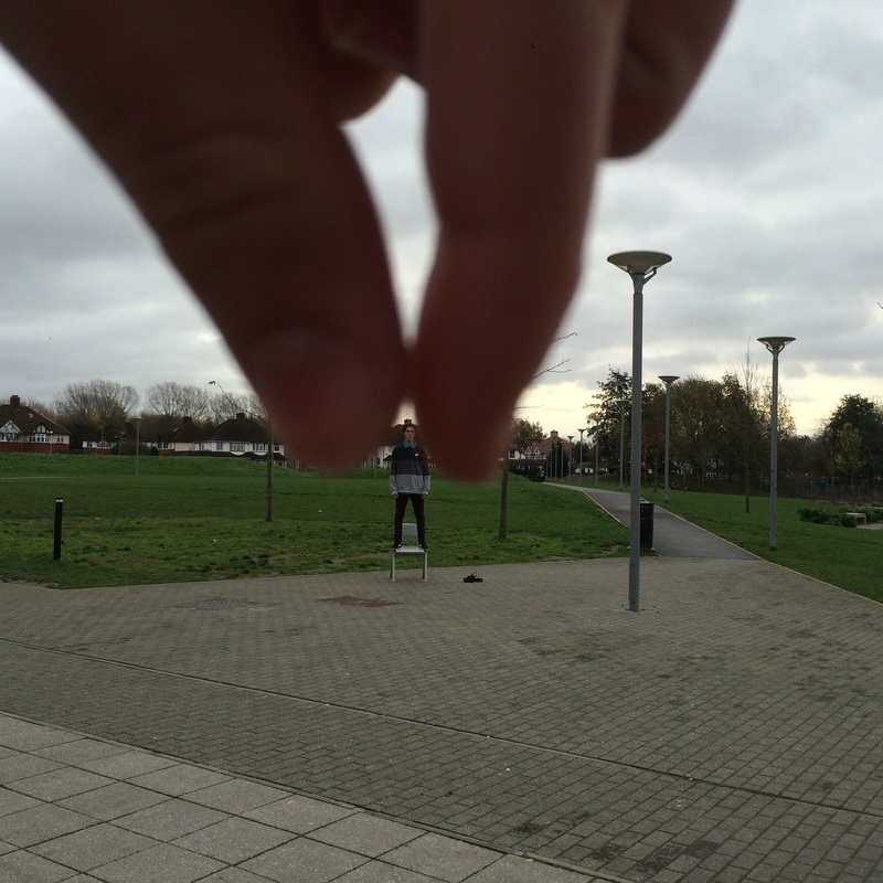
Activity #6: Force Perspective - Fourth Experiment
|
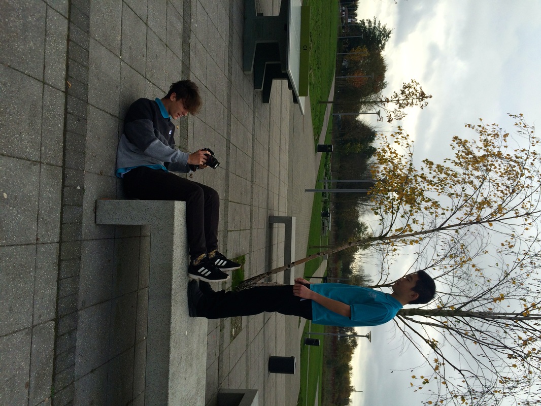
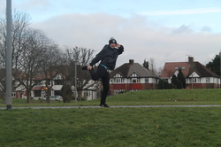
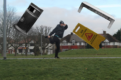
Then i went out a took the images ( with a IPHONE 5s ) I used 4 people over all to help with my images, i used a sort of inspiration from certain photographers for example one of there images had a person sitting on the chair upside down so i tried recreating it but it my own way in a different environment and with a different bench or chair; The first two images represent that because i have made it look like there falling and sitting down but really if i didn't use photoshop and change different aspects to the image it would look a lot different. I want to still go out and improve these images for example the one with the foot over the person sitting down i think i could get it in a better light and see if it would look better taken on a different camera or even go to the dark room and develop them. The things i want to edit still is the one with the fingers pitching over someones head, i want to take away the chair and move the person forward and reduce the size of the hands or i might just go take it again. However i really like my first experiment because there isn't an image i don't like i think most of the images have the right contrast and lighting that they need to make the image successful however i need to add some more improvements.
The Steps That i am want to take next: 1. Re-Take images 2.Edit and use photoshop 3 hopefully find a final piece out it |
|
Activity #6: How i get to my final pieces
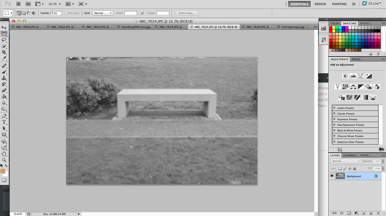
First Step:Use The 'QuickSelectionTool'
|
I went onto photoshop and i had to use the QuickSelection tool which basically copies the object that i need to move to the image i want, which is directly below:
|
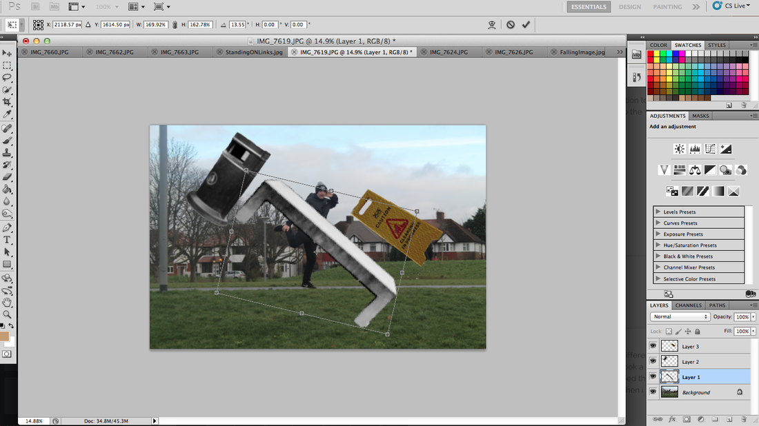
Second Step: Turn and place the object in the correct position
Then i need to move the photo to the correct position by 'Press CMD and T to adjust the size then rotate the object to the correct position`; Then should Look like this:
|
|
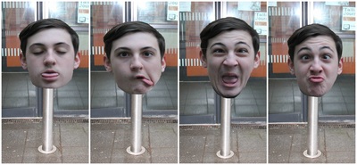
Activity #7: My Final piece's
These were a range of images, which i gathered my initial idea from Pinterest. The process i went through to get this images the way they look now, firstly i took the heads off a left the white back ground of the missing head aware, i thought it looked good at first but then i put them all together they look very unprofessional, that is when i used the sticker tool on photoshop to rearrange the background and make it suit the original background, which is what you can see above.
But throughout the project i feel i have portrayed all my images with a absurd, surreal effect, i feel that the no heads gives a very mysterious and super natural effect, how the contrast matches with its surroundings so much considering i took these photos in different places and added other things into them afterwards.
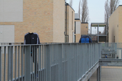
The first image was very hard to edit and get to a standard which i wanted as, i had to cut his head off but because his head was in front of the building i had to edit everything again to make it the same, I had to copy snip its of the image, and stick it on the blank spaces to blend it in so there was no faults with it, I really do like this image because it has a very normal and surreal look but then it gives a mysterious look which gives a huge contrast for the viewer, however i wasn't to sure if i should of changed the capacity of the image to make it lighter or darker or keep it the same. which was a really hard decision. The thing i wish i changed was the positioning of the image ( The position i took it in i don't know if i should of taken it from above or direct on on ).
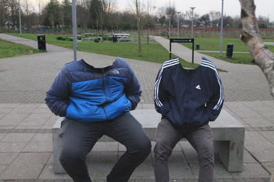
The second image was quite tricky in the sense that it was quite hard to cut the edges around the edge of the collar on there coat, thats why it looks quite flaky and disjointed In places. However i quite pleased with how it turnout over all, because the close up of the image gives away the absurd effect straight away, because you just see straight through them, I very much like the tone and the lighting of the image, as i changed the capacity on the camera to the way i wanted it for the head to be emphasised .
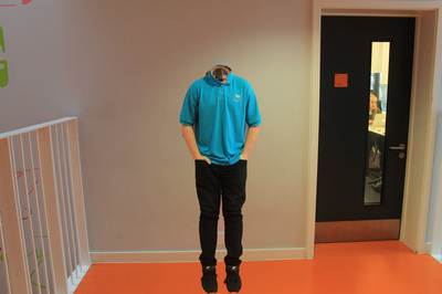
The third image was very easy and simple, i found an image of a hole In the wall and put it up and made him stand in front of it, then i took a picture of him standing there a one with just the wall, then i just adjusted his body to fit his neck to the crack in the wall , It looks quite eery and weird as you can see behind the wall and this is probably one of my favourite image. however i should of made the image more condensed and less of a surface area
But throughout the project i feel i have portrayed all my images with a absurd, surreal effect, i feel that the no heads gives a very mysterious and super natural effect, how the contrast matches with its surroundings so much considering i took these photos in different places and added other things into them afterwards.
The first image was very hard to edit and get to a standard which i wanted as, i had to cut his head off but because his head was in front of the building i had to edit everything again to make it the same, I had to copy snip its of the image, and stick it on the blank spaces to blend it in so there was no faults with it, I really do like this image because it has a very normal and surreal look but then it gives a mysterious look which gives a huge contrast for the viewer, however i wasn't to sure if i should of changed the capacity of the image to make it lighter or darker or keep it the same. which was a really hard decision. The thing i wish i changed was the positioning of the image ( The position i took it in i don't know if i should of taken it from above or direct on on ).
The second image was quite tricky in the sense that it was quite hard to cut the edges around the edge of the collar on there coat, thats why it looks quite flaky and disjointed In places. However i quite pleased with how it turnout over all, because the close up of the image gives away the absurd effect straight away, because you just see straight through them, I very much like the tone and the lighting of the image, as i changed the capacity on the camera to the way i wanted it for the head to be emphasised .
The third image was very easy and simple, i found an image of a hole In the wall and put it up and made him stand in front of it, then i took a picture of him standing there a one with just the wall, then i just adjusted his body to fit his neck to the crack in the wall , It looks quite eery and weird as you can see behind the wall and this is probably one of my favourite image. however i should of made the image more condensed and less of a surface area
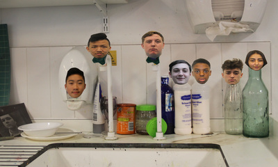
Activity #8: Second final Piece
Чтобы изменить, нажмите здесь.
Чтобы изменить, нажмите здесь.
My final Evaluation!
These are the range photograph's which i captured and edited on ( PhotoShop and PicMonkey ) trying to look for a final piece!
My process of thought which i was using to take these images was to go on Pinterest and find some ideas on how to layout and make my images look as absurd as possible. Looking at these images i think i have made a good effort, however i don't like the way they came out and are layer out. I think they don't look professional or even to a standard of being a final piece, the next step i want to take is going back to Pinterest and taking some more ideas and combining them with the ideas i have used above. The things i need to improve on my next attempt is the time and effort i put into the photoshop because the way i edited the images for example how i cut the heads of with the crop tool on photoshop. Like they don't look good enough to get a good Grade. Also i don't like the lighting of most of the images because they look to dark, like i want them to be bright and happy with like a mysterious and eery back ground. Also i want to make a range of photo's which match each other like they go together.
My process of thought which i was using to take these images was to go on Pinterest and find some ideas on how to layout and make my images look as absurd as possible. Looking at these images i think i have made a good effort, however i don't like the way they came out and are layer out. I think they don't look professional or even to a standard of being a final piece, the next step i want to take is going back to Pinterest and taking some more ideas and combining them with the ideas i have used above. The things i need to improve on my next attempt is the time and effort i put into the photoshop because the way i edited the images for example how i cut the heads of with the crop tool on photoshop. Like they don't look good enough to get a good Grade. Also i don't like the lighting of most of the images because they look to dark, like i want them to be bright and happy with like a mysterious and eery back ground. Also i want to make a range of photo's which match each other like they go together.
