Personal Project #5: Abstraction
The formal elements
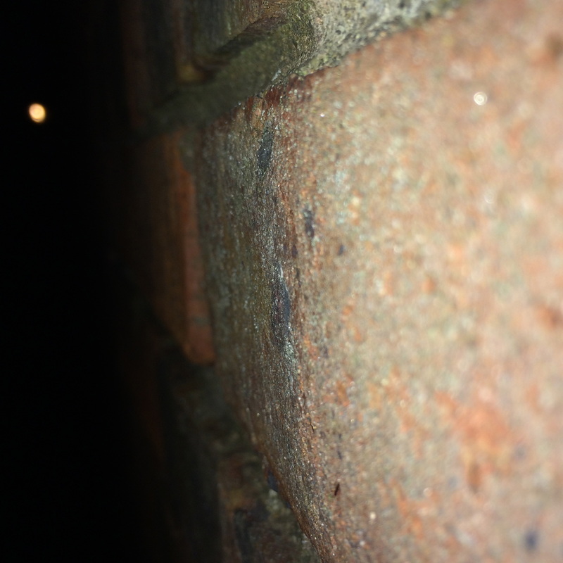
Focus: The whole subject is in focus. however you can see a soft blurred point near the edge were its slightly out of focus.
Light: There is a varied amount of light in this photo with a broad amount of colours ( red, green, orange and yellow) however the light is used very effectively in this image because its made laid out very equally.
Line & Shape: This image is has various amount of shapes lines going in ever direction for example in the middle you have circles over lapping each other, however you have lines come through and looks to have some fury bush peeking out.
Repetition: There is a wide range of repetition in this photo, there is circles overlapping and intervening with each other and that sort of gives it and unknown object.
Space: The space in the image appears quite shallow, tightly constrained by the cropping. We don't the whole of any of the objects and the photographer appears to have been quite close to the subject.
Texture: All of the objects in the image appear smooth. The drama comes from the jagged bursts of light across their surfaces.
Value/Tone: The image contains a range of tones from very dark to very light. There are deep shadows but also mid tones. The photograph is monochrome but has a brownish tint, perhaps caused by the paper the artist has used.
|
|
The Formal Elements
These where my first examples of Abstract, however i didn't know which aspect of Abstract i wanted to do; i had some advice and what how i should lay it out , so i decided to do three topics ( Line,Light and Texture) which hopefully will be successful.
As you can see on the right of this piece of writing there is a view examples of what i have done, To me they mostly include all of choices except light which is a downside due to it could make the image successful and even my final piece which is more inspirational. In the future of this topic i want to include more formal elements to see if i can make an image or take an image which will be full of the natural formal elements. My Photography HomeworkThe photo's i will be using for my project with be the theme of Line,Light and Texture because when i usually take photo's they are the usual formal elements that are present. I like these three photo's because each photo is presented on one of three element Light,line and texture.
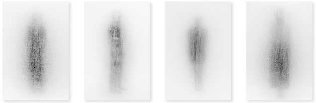
Francesca woodman |
This photo was taken by John Batho who is a famous photographer. In this photo the focus is very unusual because there is a suspicious creepy look to it, however it looks like someone is standing there behind a window with a blurred effect. This photo has got much light it powered by darkness and lightness because it this photo its just 'black and white' which to me gives a boring but mysterious affect. There isn't really anyone narrow lines in this photo however there is a shape of a human's body which you can see faintly. There is a lot of repetition in this photo for example in each of these has the same sort of theme like a blurred out figure of all shapes and sizes. There isn't a lot of space in the images there very tight fitted. I think the texture would be quite damp but smooth and the image has only 2 tones which are dull and light.
My homework
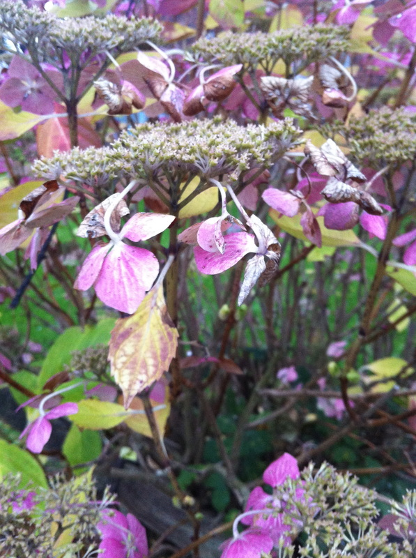
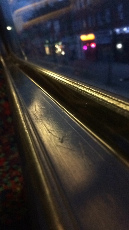
The few images i took my new camera, where actually quite good and what i would like to take in an image however in these range off photo's i would of liked to got some of the images out of focus which would of given it a more emphasised look regarding my choice of abstraction (Light, Texture and line) What i am going to do with my next set of images i am going to work of the composition and the focus of my images, My favourite image that i had take was the one with the light and the stair ralling because it covered all the elements i need to cover and i liked the image aswell, also i think it is good enough for a final piece in my opinion.
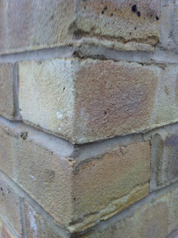
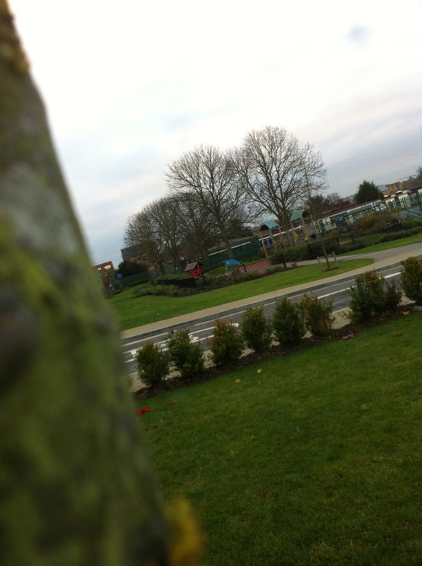
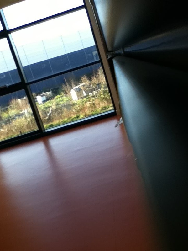
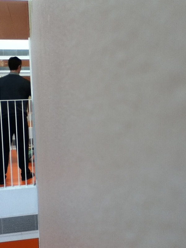
My homeworkI took a range of images on the topic of Abstraction (line and texture) i took these images mainly in my house to see how the setting was and would it suit the final piece i am looking for. I don't really like some on the images due to out of focus or the composition isn't right. In these photo's they feature line and texture and when i thought about taking images in my house i thought edges of tables and surfaces and also trying to get a glimpse of light which sort of worked in my images which i like
Paul strand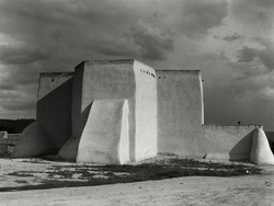
I like this photo that 'Paul Strand' took how ever it was taken in 1890, it looks like a photo that would of been taken in this day of age, it looks like it has been edited. I like this photo because its original the composition is amazing and the structure is great i like also the angle he has taken it in, because it makes the image look more surreal. however because the image was taken in 1890 thats means that the photo wouldn't be high quality or in colour, but to be honest this image looks amazing the way it is there is no improvements i would say there needs to be accept i would like it to be out of focus, which would give it a better look and more artistic .
|

Were Am I Going Next?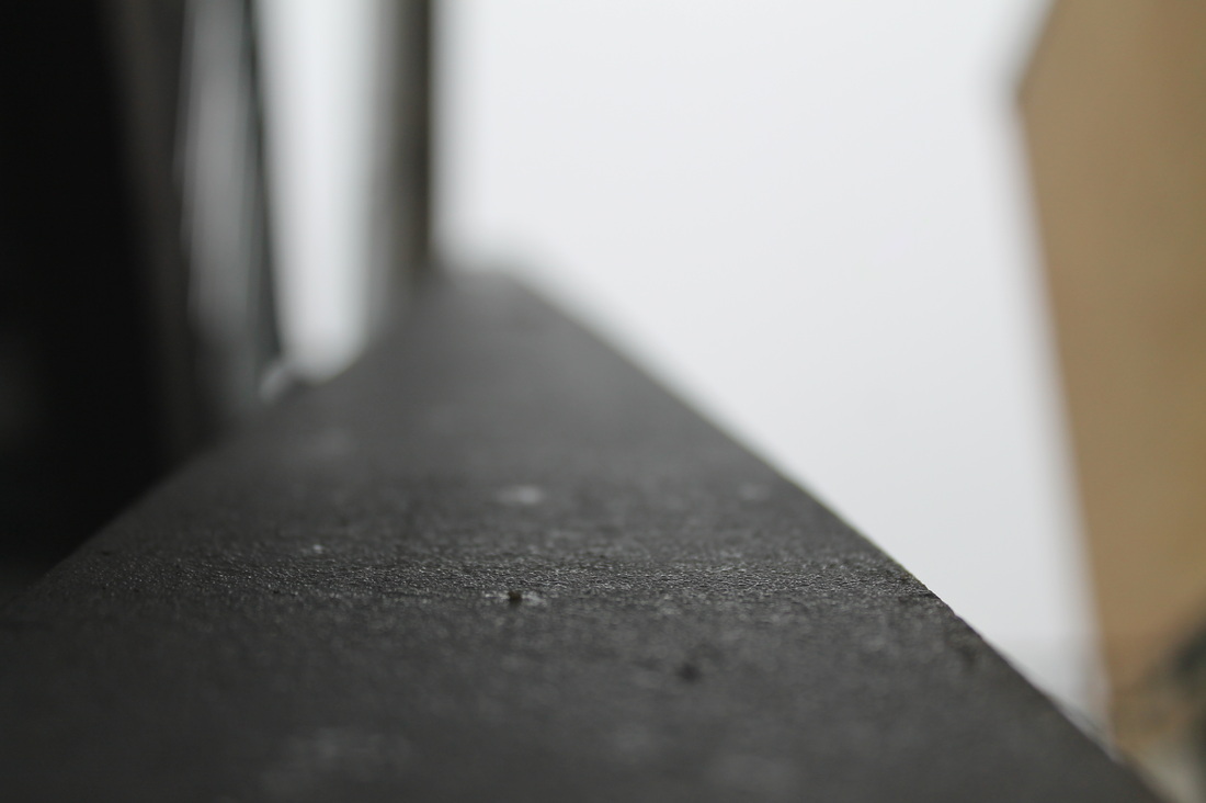
|
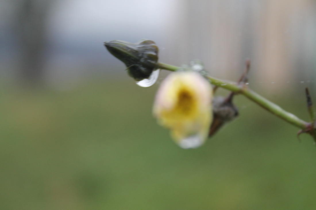
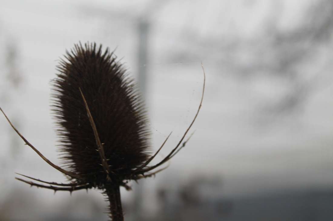
In the future of this project, i want my images to be based on the same type of image on the left. But i want to change the scenery as i am getting a bit bored of it. In my next day out taking photo's i want to go for a more countryside / forest type, because as i see it there is much to explore in them settings so hopefully i might get the most out of it and come back with a final piece hopefully or even tips or improvements on my topic. Throughout this project i have aimed to find a final piece but now i understand that when i take photo's now i need to compare them to my other photo's to see the difference's and the improvements and things that still need to improved for e.g if the focus is bad work on that in my next image if the composition is right then look how to fix that.
|
|
I think all of these images that i took on my photography homework have a big simularity, in all these images there are based on edges and surfaces. In the future i would like to change the scenary because i cant seem to like any at the minute i thought my work was like 'Harold .E.Edgerton' because his work was shaped and taken like mine however i want to change my scenary like his to cooking utensils which i have done before , however i did that in a different project. I would like to get started using effects on my work to get more of a relistic affect to my work, I liked the tone Harold used because it was light and dark effect like the middle was brightened like a light and the out ring is getting darker. I dont know if he used effects or not however i would like to investigate how to make my images like that , his composition and how it took the image is very good i dont think there is another way he could of taken his images to take them better . Also in his images his images apply the rule of thirds in most of his images which shows that he has structered and taken his time on his images,
|
|
My Final Evaulation
I started off this project with not a clue of what to do, i thought were is my starting point , what do i do first. Then i first looked at Roger Colson's work and it inspired me to go out and take images from an edge of everything not taking images on a normal angle. I think i did well to do that, i was a very long process for e.g I had to take alot of photo's and in the end the photo's i took in the start were better layed out and constructed then the others that i took recently that i took alot of time and effort for. The thing that helped me in this project was to take images quick and fast and alot of them dont sit there and take your time, you need to take loads to find a successful Final Piece. The Best thing of how i did my project on abstraction is i did it sort of unique to myself however guided by my choosen artist. My final pieces above are in different catagouries One side is edges and the other is nature and Plants. I am very happy with my final pieces which i have shaped into boxes for my final piece to present in the gallery we will all be presenting in. In some of the photo's one of the things that was holding me back was light and tone i couldnt really get the tone and light that i needed for my photo's because it was allways dark and rainy so i imprevised i changed the style around and the atmosphere that i was taking it in. I needed a new area and start because it was getting a bit dull were i was taking my images, So i went home and i thought were i could take photo's so i structed some of my images around my house and my local area. i had some guidence from my teacher on how to present my photos so i thought on the line of maths and shapes and but them together to make 3D shapes with my photos to give it a more eye catching site and not dull and boring like just in a frame i want my final piece to stand out. My final aim i wanted for this project was to succeed in what i wanted to do and to take some magnificant images. My opinion my images are fantastic but they are what i need. The composition is not perfect, however i really like the tone of my photo's it sort of gives them effects on the photo however there is no effects on my photo, the one thing i love about my images is the focus and the rule of thirds. In all of my final piece images they are all focused in the middle and out of focus on the outside and in some of the images there is the rule of thirds which i spotted when i first took those images.
